
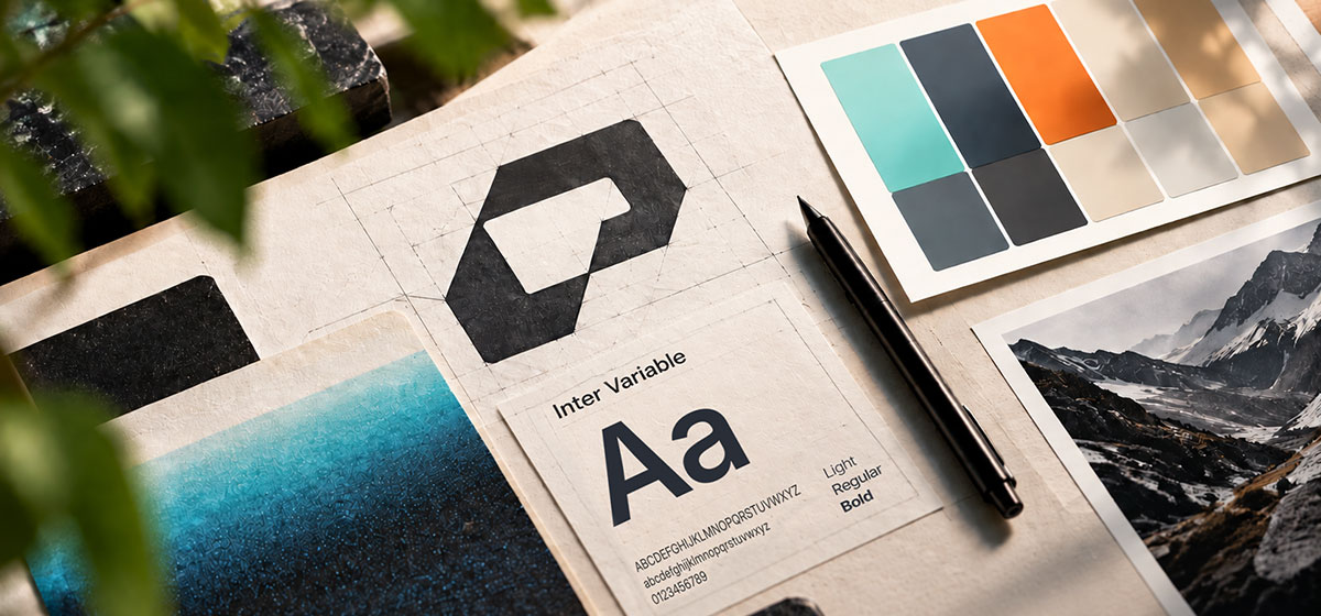

Today, Logical Position becomes LP. If you’ve known us for a while, that probably doesn’t sound like much of a change. Clients, partners, and employees have been calling us LP for years. Now we’re making it official.
You’ll see a new logo, a new design for our website, and an updated URL. But this change goes beyond a refreshed corporate aesthetic. It reflects the evolution of our company, our industry, and the work we’ve been doing for clients since 2010.
Over the last 16 years, we’ve served more than 10,000 clients, worked with some of the most recognizable brands in the world, and become a leader in managed ad spend across Microsoft, Google, and Meta. And somewhere along the way, our name stopped describing everything we do.
In the early days, our name fit. Our founder, Michael Weinhouse, landed LP’s first client on the day we opened shop in Beaverton, Oregon. Back then, our name was our job description: We found the most logical position for our clients’ ads on Google. Our approach worked, and we grew fast. What began in that 900-square-foot office space shared by three people has become a company of hundreds working from locations across the country.
We didn’t begin this brand discovery project intending to change our name, but the process revealed how far we’ve come.
Before we thought about logos, colors, or names, we started with the people at the center of our business: our clients. We asked them what it was actually like to work with LP, and their answers helped put words around something that had been happening for years. They didn’t describe a vendor. They described a partner. They talked about LPers helping them think through new product offerings, market expansions, technology adoption, and the countless decisions that come with growing a business.
Our job had become much more than finding the right position for an ad on Google. Our brand needed to catch up.
This evolution happened alongside larger changes in our industry. Smaller shops are being absorbed by holding companies. AI adoption is challenging us to be more innovative and efficient than ever. And in this new age of the industry, what risks being lost is the personal connection behind strong agency-client partnerships.
While we use many of the same platforms and technology as everyone else, what makes LP different is the people using them. It’s the LPers who pick up the phone when a client has an urgent question. The experts who dig into a problem when the numbers don’t make sense. The teams helping launch new products, uncover opportunities, and deliver monthly reports everyone wants to see: arrows trending up and to the right. That’s what we’re carrying forward.
This mission continues with a new name, new logo, new colors, new typography, and a new home at lp.agency.
While our brand’s visual identity is changing, one element remains: a sense of forward motion, up and to the right. It’s been part of every iteration of the LP logo since 2010.
We may have outgrown our name, but we haven’t outgrown what that idea represents. The goal is still to bring the right elements together to drive continuous growth. And we’ll keep pushing in that direction for every client we work with.